HIRO (Japan, 1930),
DAVID HOCKNEY (U.K., 1937)
Demultiplications
Colour photography, because of the scarcity of its hues, its floating values, the transparency of every blur, thus invites to the demultiplications of a photograph inside itself, either by contrasted internal echoes or by contrasted internal overlaps. The first case applies to Hiro, the second to Hockney.
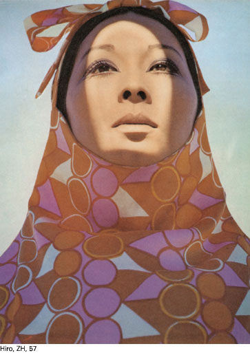
1. Internal contrasted echoes: Hiro
Being Japanese (for whom perception consists in emotional (re)attacks that are both incessant and intense), Hiro has a taste for the refreshing activating interval, the ma. However, as colour photography is diffusive, it could not trigger pure voids as those encountered in Ueda and Suda’s black and white. However, it has another resource: repeating a same form in Russian dolls, with diverse values and saturations of a same hue or of several. The system is ancient in Japan, where it was used by Japanese erotic painters to render the vision orgasmic, in particular for the female sexual organs. The Japanese erotic cinema used the same technique for sequences edited image per image.
The stormy echo hence produced – Hiro’s photographic subject – is not alienating, blowing, mediatizating. It is at the opposite of the western Echo, the Narcissus’ lover, who was a paroxysm of Greek mediation. Rather, it takes away any comfort of unity and totalization from perception, makes it felt as a (re)departure of the same-other. Under the condition, assuredly, that the colour be acid, should not give into weight, and provokes something of this deep surface or surface depth which Tanizaki defines as the base of Japanese topology in the Eloge de l’Ombre.
In the issue 13 of ‘Zoom’ (ZH) which includes the most important collection of Hiro photographs, we could have illustrated his subject using a sky, whose pleats multiply the cut-out of a mountain (ZH, 80) or through the echoes that surround the head of Berkley Johnson on the cover. Rather than using these too direct examples, we preferred the difficult yet fecund case where he accomplished himself through the echo of only two violently-contrasting liminances on a face (*ZH, 57), hence conjoining paradoxically the cut-out and chiaroscuro, the latter being de-mediatised by that one to the benefit of a deep and surfacing shadow according to the Tanizakian program.
 |
In any event, the reality-image of the fifties, in the work of Penn, has found a matter that is consubstantial in the work of Hiro: the matter-light-form-image-colour of the plastics, which are simultaneously transparent and coloured (ZH, 51, 53, 77). The entire ‘Zoom’ collection deploys this new ‘median reality’ – which is simultaneously matter and form, nature and artifice – that, under the auspices of the jewel, joins the flesh (ZH, 51, 53), the technical transport object (ZH, 76), the communication relay (ZH, 80), the architecture setting the bodies (ZH, 58), right up to the couples of bodies setting each other mutually (ZH, 60, 61, 65). The lying ‘S’ in acid red-coloured plastic in front of the mountain that itself is covered in an artificial-natural light (ZH, 77) is probably the archetypal Hiro image.
Hiro is the last fashion photographer that we will meet in this book. It is therefore time to salute the decisive role that fashion in general – with advertising – has played in the history of photography for a good half-century. We underlined this for Irving Penn, but should have equally insisted for Richard Avedon, Diane Arbus, William Klein, and Helmut Newton. Fashion is often deeper, more audacious and prophetic than the reportage and abstraction. Systematically jumping above trivial psychology and sociology, it commits ontology and cosmology through the image of the body and the environment, the acquaintances of the Sign and of a certain death, the dimensions of space, the reversibility or the irreversibility of time. The issue of AD/ART, published by designer Cheyco Leidmann at Love Me Tender publishing in 1983 gives a scope of these stakes.
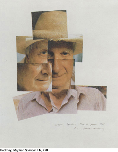
2. Contrasted decalage: Hockney
In 1982, in David Hockney Photographer (DH), Hockney explained why he used contiguous photographs. Photography, made by a Cyclops object, could not supply the binocular show that painting offers. Even if the latter is not tri-dimensional, it results from the hand and the brain of a painter who usually works with both eyes. However, by overlapping photographs, we can hope – says Hockney – that we will find something of the effects of binocular parallax. He started using this process by overlapping five photograph of his friend Peter Schlessinger as soon as 1972 (DH, cover), reached the peak of this technique in his 1985 Stephen Spender (**PN, 278), and its diversity in 1986 Pearblossom Highway (FS, 387). Contiguous photographs call upon colour, which alone is sufficiently shining to link their disparities.
 |
If there, painting makes a suggestion to colour photography, we must see what the latter suggested in return for Hockney’s painting. His homosexual vision (very different to Francis Bacon’s whose ‘beautiful colours’ roam around the wound and the forbidden penetration) calls upon a show that is convex and sparkles from everywhere, without concealment, even in the shadows. However, only colour photography – through the combination of frank Cyclopean and coloured massiveness – could supply him this, under the condition that the theme was angular from the start. This is the demonstration of the photographs of the Nid-du-Duc swimming pool, dated 1972 (DH, 32), at the root of the famous Paper Pools, dated 1978.
A medium that is flat, stretched, and strict as ordinary photographs serves well Hockney’s intentions. In his work, the frescoes of colour Polaroid – such as the Portrait of David Graves in 1982 (DH, 95, 96) seem to have lasted a long time. As shown in the work of Stefan De Jaeger (PHPH, 62), the colour Polaroid – small or large – is more the instrument of the continuous and the milky, almost Rubean depths.
Henri Van Lier
A photographic history of photography
in Les Cahiers de la Photographie, 1992
List of abbreviations of common references:
PN: Photography until Now, Museum of Modem Art.
The acronyms (*), (**), (***) refer to the first, second, and third illustration of the chapters, respectively. Thus, the reference (*** AP, 417) must be interpreted as: “This refers to the third illustration of the chapter, and you will find a better reproduction, or a different one, with the necessary technical specifications, in The Art of Photography listed under number 417”.